颜色真的会改变我们的情绪吗? - BBC克劳迪娅.哈蒙德 (Claudia Hammond)(2023年8月1日)

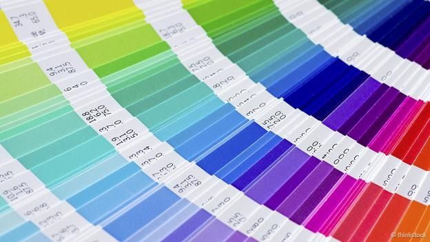
我们会花好几个小时选择房间涂料的颜色,以便正好营造出自己想要的氛围。我们会研究涂料色卡良久,再把测试涂料带回家。医生的手术室通常会涂成白色,这给我们带来一种医院的清洁感,快餐店会涂成红色或黄色,有的牢房则涂成粉色,希望能减弱囚犯的攻击性。
我们可能认为自己了解不同颜色的作用。红色令人振奋、蓝色令人镇静这样的看法深植于西方文化,许多人认为事实就是如此。但颜色真的像我们认为的那样能改变我们的行为吗?
有关科学研究的结果令人喜忧参半,有的还存在争议。红色是被人研究最多的颜色,它往往被拿来与蓝色和绿色比较。有些研究表明,与蓝色或绿色相比,人们面对红色时,认知作业成绩会更好;其他研究却又得出相反的结论。
条件反射是最常被引用的原理。如果屡次在某种颜色的环境中获得一种特定的体验,最终,人们会开始把这种颜色与自己的感受或行为联系起来。
有人认为,在学生时代,老师会把作业中的错误用红笔圈出,这导致人们一直把红色与危险联系起来,而红色水果往往有毒这一事实也突出强调了这一认知。另一方面,人们很可能把蓝色与安静的环境产生联系,如星空下的大海、广袤蓝天下的美景。

(图片来源:Thinkstock)
当然,总会有例外情况。老师写“优秀”的评语用的是红笔,树莓也是红色,可是却很好吃。人们确实会把不同的颜色与不同的事物联系起来,但这种联系是否会以某种方式对人的行为产生影响,或者对某项特定工作的顺利完成产生影响,却是另一回事。
鉴于以往得出的结论不一,英属哥伦比亚大学的研究人员决定尝试彻底澄清这个问题。那是2009 年。他们让受试者坐在电脑前,电脑屏幕分别设为蓝色、红色和“中性色”,并针对不同的任务对受试者进行测试。
坐在红屏电脑前的受试者在完成需要注重细节的任务时,如记忆力测试和校对测试,取得的结果较好;坐在蓝屏电脑前的受试者在创造性任务测试时取得较好结果,例如设想一块砖头的用途,越多越好。
研究人员推测,红色给人“回避”的暗示,因而人们会更为小心,而蓝色则相反,给人一种“接近”的暗示,促使人更自由地思考,因此更能激发人的创造力。为检验这一假设,研究人员请志愿者猜字谜,将打乱的字母重新组合成正确的单词,这个任务涉及回避和接近两种行为。
如果要回避的单词在红色背景上显示,受试者倾向于更快地解开字谜;而接近类的单词在蓝色背景上显示,他们会更快地解答出来。这表明,颜色和行为在他们的思维中是有联系的。
研究团队甚至对他们研究结果的实际应用进行了检测。例如,他们设想根据当前任务的性质将墙壁涂成不同的颜色:如对研究新药副作用的团队,办公室墙壁涂为红色;对进行创造性头脑风暴的团队,办公室墙壁则涂为蓝色。实际应用中,这种做法可能很难做到。在办公室或教室中,有时候需要发挥创造性思维,有时候却需要关注细节。
警告?渴望?
无论如何,现在这项发现本身受到质疑。2014 年,另一个研究团队试图对更多受试者重复上述部分研究,颜色的影响却消失了。前面的研究有 69 名受试者参与,这次研究则有 263 名志愿者参与,背景颜色则并无变化。
研究团队也对另一个重大研究结果提出质疑,最初的 研究结果由奥利弗·甘乔 (Oliver Genschow) 在瑞士巴塞尔大学提出。甘乔的团队为接受测试的志愿者提供了一盘椒盐脆饼干,请他们根据需要想吃多少吃多少,然后评价饼干的口味。
可喜的是,有六分之一的受试者不得不被排除在外,因为他们将饼干与他人分享,而这与研究目的不符。在考虑到上述因素后,红色似乎又一次成为警告的颜色,拿红色盘子的人吃得饼干要少一些。但是,阿巴拉契亚州立大学的研究人员按照同样程序所做的研究却得出了恰恰相反的结果:拿着红色盘子的人吃的饼干更多。
粉色监狱
显然,研究颜色的影响比表面上看来的那样要更难 — 也许颜色并不会像我们想象的那样产生影响。不过,我们还是有足够理由相信,对美国、瑞士、德国、波兰、奥地利和英国的一些监狱而言,颜色的确能产生影响,这些监狱将牢房涂成一种特别的粉色。
瑞士有 20% 的监狱和警察局至少都有一间粉色的牢房。这种粉色我称之为奶冻粉色,但其正确名称为“贝克-米勒粉红” (Baker-Miller pink),因为两名美国海军军官首先对粉色墙壁对囚犯的影响进行研究而得名。

(图片来源:Thinkstock)
那是在 1979 年,研究人员给囚犯出示蓝色卡片或红色卡片,要求他们抵抗实验人员将他们胳膊压下去的压力。在出示蓝色卡片时,他们推得更用力,而出示粉色卡片时,他们的攻击性不知怎么就减弱了。当然,事实也许并非如此。实验人员知道出示卡片的颜色;因此,即使没有意识到这一点,他们也可能在出示红色卡片时,减轻压囚犯胳膊的压力。
此外,他们在用粉色卡片和蓝色卡片测试之前已经进行过测试,因此,也许在用蓝色卡片测试时,他们只是压得更熟练而已。为复制上述研究结果,对研究方法加以改进后又进行了几次测试,均以失败告终。
随后,他们又在真正的牢房进行测试,这些牢房被涂成粉色——用一品脱红色涂料与一加仑白色涂料勾兑,得到这种可爱的粉色。测试结果依然是对受试者没有什么变化,也许重新粉刷牢房会有影响,而不是因为颜色是粉色。
2014 年,甘乔的研究团队进入一个戒备极其森严的瑞士监狱,再次对上述假设进行测试。他们的研究方法比30 年前的研究要先进得多。违反监规的囚犯被随机关入整个涂成粉色的牢房,或是四壁涂成灰色、天花板涂成粉色的牢房。
研究团队事先对狱警进行了培训,要求他们采用一种攻击量表对囚犯的行为进行评估。对于因违规被关入粉色牢房的囚犯,研究结果令人失望。被关三天后,两种牢房中的囚犯比关入牢房前的攻击性都有所减弱。墙壁颜色根本没有产生任何影响。
研究人员承认,规模更大的研究也许会发现颜色有影响,但如果颜色只会对少数人产生影响,那么是否值得一试就需要三思了。研究人员甚至指出,牢房墙壁涂成奶冻粉色可能还会有负面作用,因为一般认为粉红色代表女性,让囚犯住在粉红色房间里可能会使其认为有辱人格。
因此,颜色也许会有影响,但目前而言,这些影响难以持久,有时候甚至完全不存在。虽然有更好的研究方法在逐渐出现,但要全面了解颜色对我们的影响,仍有待时日,更不必说了解颜色影响背后的确切原理了。目前看来,室内装饰还是应该一如既往,从个人品味和艺术欣赏角度出发为妙。
(责编:郱书)
Do colours really warp our behaviour? - By Claudia Hammond
We can spend hours choosing the right paint colour for a room to create just the mood we want. We pore over paint charts and bring home tester pots. Doctors’ surgeries are painted white to give us that sense of clinical cleanliness, fast food shops are red or yellow and some prison cells are painted pink in the hope of reducing aggression.
We might think we know which colours do what. The idea that red wakes us up or blue calms us down is deeply engrained in Western culture - to the point that many consider it a fact. But do they really change our behaviour in the ways that we assume?
When it comes to scientific research, the results are mixed and at times contested. Red is the colour that gets studied most often and tends to be compared with either blue or green. Some studies have found that people do better on cognitive tasks when faced with red rather than blue or green; others show the opposite. The mechanism most often cited is conditioning. The idea is that if you repeatedly have a particular experience surrounded by a certain colour, then you eventually begin to associate that colour with the way you were feeling or behaving. It’s been suggested that a school career spent reading your teacher’s red writing circling your mistakes forever makes you link red with danger and this is underlined by the fact that poisonous fruits are often red. Blue meanwhile is more likely to be associated with calmer situations like staring at the sea or marvelling at a big blue expanse of sky.
Of course there will always be exceptions – the comment from the teacher saying “well done” is also written in red and raspberries are red, but perfectly edible. It is true that people do make different associations with different colours, but whether this translates into behaving in a certain way or succeeding at a particular task is a different question.
After so many mixed results in the past, in 2009 researchers at the University of British Columbia tried to clarify the situation once and for all. They sat their participants at computer screens coloured blue, red or “neutral” and tested them on various tasks. With a red screen people did better on tests of memory and proof-reading, tasks requiring attention to detail, but when the screen was blue they did better on creative tasks, such as thinking of as many uses as possible for a single brick. The authors speculated that red signalled "avoidance" and so they were more careful, while blue motivated the opposite: an "approach" behaviour that encouraged them to be freer with their thinking, resulting in more creativity. To test this idea, the researchers then asked the volunteers to solve anagrams of different words – relating to either avoidance or approach behaviours. The subjects tended to solve the avoidance words faster if they were presented on a red background, and the approach words more quickly if they were presented on a blue background – suggesting that the colours and behaviours were associated in their minds.
The team even speculated about the practical uses of their findings. For example, they wondered whether walls should be painted different colours depending on the task at hand – red for a team looking at the side effects of a new drug, for example, or blue for a room for creative brainstorming. In practice this might be tricky. In an office or a classroom you might want to think creatively some of the time and pay attention to detail at others.
Warning, or desire?
In any case, question marks are now hanging over the discovery itself. When another team tried to replicate the anagram part of the study with a larger group of people in 2014, the effect of colour disappeared. The initial study comprised just 69 people. In this new, bigger study, of 263 volunteers, background colour made no difference.
The same team also raised questions about another landmark finding, originally conducted by Oliver Genschow at the University of Basel in Switzerland. Genschow’s team had offered their volunteers a plate of pretzels, and told them to eat as many as they felt they needed to make a judgement about the taste.
Rather sweetly, one in six people had to be excluded because they were kind enough to share their pretzels with others which defeated the object of the research. But when that was taken into consideration, the colour red once again seemed to serve as a warning, and people offered pretzels from a red plate took fewer. Yet when the team from Appalachian State University followed the same procedure their results were the exact opposite – people with red plates ate more pretzels.
Pink prisons
Clearly, studying the effect of colour is much harder than it looks - or maybe colours just don’t have the effect that we expect. Yet we are convinced enough that they do for some prisons in the USA, Switzerland, Germany, Poland, Austria and the UK to paint their cells in a particular shade of pink. In Switzerland 20% of prisons and police stations have at least one pink cell. It’s a shade I’d call blancmange pink, but its proper name is Baker-Miller pink, after two US Naval officers who first studied the effects of pink walls on prisoners.
Back in 1979 prisoners were shown a blue card or a pink card and then had to try to resist the pressure of the experimenter pushing down on their arms. With the blue card they pushed harder, so was the pink card somehow reducing their aggression? Possibly not. The experimenter knew which card had been shown, so without even realising it they might have eased up a bit on the pink card. What’s more they had a trial run, followed by the pink card and finally the blue, so perhaps they were just more practiced when it came to the blue card. Several attempts to replicate these results in better-designed studies have failed. But they did follow up with an experiment conducted in real prison cells which were either white or pink, mixing a pint of red paint with a gallon of white to obtain this lovely shade. Once again the order of the colours was the same for everyone, so maybe it was the repainting of the cell that made a difference, rather than its pinkness.
In 2014, Genschow’s team entered a maximum security jail in Switzerland to re-examine the hypothesis. Their study was far better designed than the research from 30 years ago. Inmates held in detention after breaking prison regulations were randomised to cells either painted pink all over or with grey on the walls and white on the ceiling. Prison officers were trained to use an aggression scale to assess the prisoners’ behaviour. The results were disappointing for those who have gone to the trouble to paint cells pink. After three days in the either cell prisoner were less aggressive than when they were first brought to cell. The colour of the walls made no difference at all.
The authors concede that a larger study might have found differences, but if the colour only makes a difference for a few people, then authorities need to make a judgement about whether it’s worthwhile. The researchers even suggest that blancmange pink walls might have negative effects if prisoners feel emasculated by having a traditionally feminine colour on the walls.
So colours might well have an effect, but so far those effects have been difficult to demonstrate consistently and sometimes don’t seem to exist at all. Better-controlled studies are slowly emerging, but it may be some time before we get a full picture of how colour affects us, let alone understand the exact mechanisms through which it happens. For the time being, interior decoration should be, as ever, a mix of personal taste and artistic flair.